Back to work Motion · iOS · 2024

Turning an exercise list into a guided program

A focused redesign that made workouts easier to understand for youth athletes entering a product built for professionals.

RoleUI/UX Designer
Timeline2 weeks
ScopeProgram page redesign
PlatformiOS
Context

Motion was expanding from professional teams into youth sports. The program page had been built for athletes who already understood their training. Youth athletes needed more context, structure, and motivation before they would commit to the work.

p°Motion · iOS · 2024
The tension

The assignment started as a UI refresh for the new design system. But the issue was not visual polish. The page worked like a task list for professionals, while youth athletes needed a guided experience that explained what they were doing and why it mattered.

My role

UI/UX Designer · 2 weeks · iOS
Reviewed workout program patterns, restructured the page hierarchy, and redesigned the exercise list experience.

Outcome
  • Updated to the new design system
  • Clearer workout structure
  • Body-area categories added
  • Experience felt more guided
Updated p°Motion youth program page showing workout context and body-area categories
01 - Context

A workout page built for professionals had to serve youth athletes

Motion's workout experience was originally designed for professional athletes. They did not need much guidance. They needed to open the app, complete the workout, and move on.

That assumption carried into the youth sports vertical, but it did not hold. Youth athletes were balancing school, games, practices, and inconsistent routines. Without a coach present, the app was not supporting them. It was just listing exercises.

Original p°Motion program page showing a minimal exercise list and workout completion counter
The original design: efficient for professionals, but light on context for youth athletes
02 - The tension

The page did not need to look newer. It needed to explain why the workout mattered.

The project started as a visual refresh. The goal was to bring the program page closer to the new design system and make the interface feel more current.

But visual polish alone would not solve the real problem. The page was not simply outdated. It assumed youth athletes already understood the purpose of each workout, already had motivation to return, and did not need context before starting.

22.1%
By day 7, workout completion had dropped to about 22.1%. Day 4 completion was about 35.9%, showing that athletes were disengaging almost immediately.

The drop-off made the issue clear. Copying a professional athlete workflow into a youth experience was not enough. The product needed to help athletes understand what they were doing, what they needed, and why the work was worth completing.

03 - Research & reference

Workout products taught the same lesson: structure creates confidence.

To ground the redesign, I reviewed workout experiences from platforms like Nike Training Club and Apple Fitness. Each product had a different visual style, but they shared a common pattern: the workout page helped users understand the session before asking them to begin.

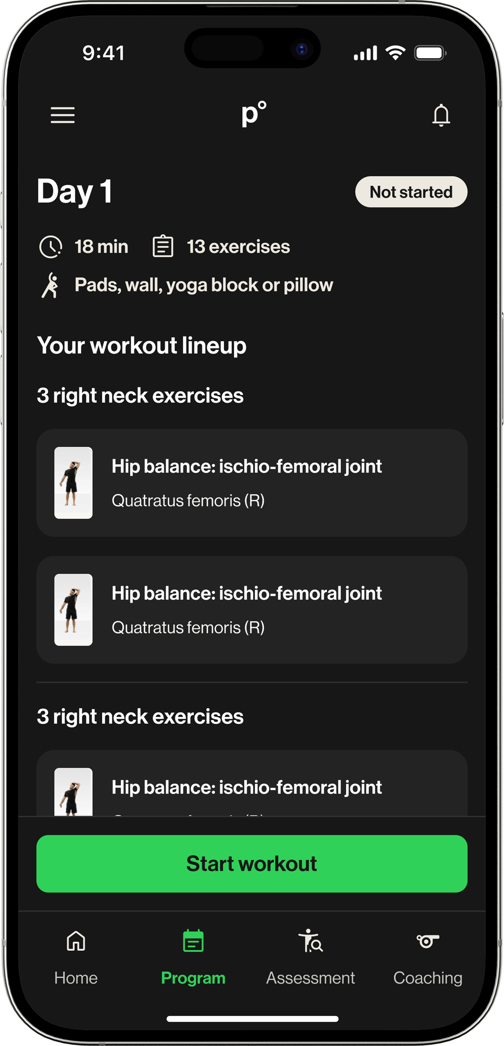
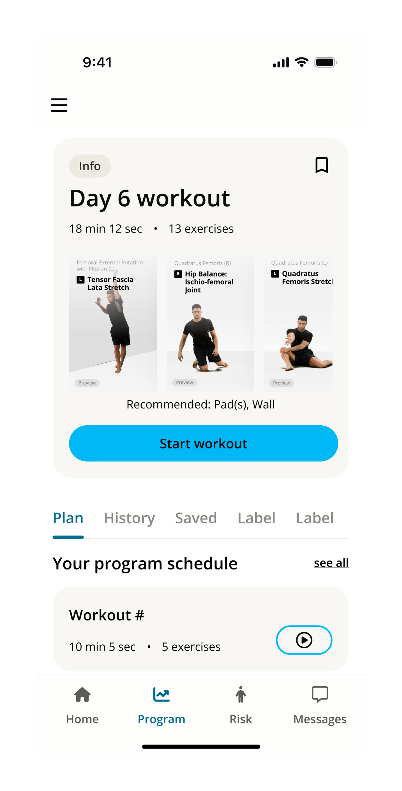
The existing p°Motion page did not do that. It mixed layout patterns, centered text inconsistently, and made practical information harder to scan. The experience felt messy at the exact moment athletes needed clarity.

The page lacked a clear hierarchy
Important workout details, including duration, exercise count, and equipment, were not presented as a simple overview. Athletes had to work too hard to understand what they were about to do.
The exercise list lacked meaning
Technical exercise names were accurate, but not always understandable. If an athlete could not tell what part of the body an exercise targeted, the workout felt disconnected from their own body.
Key finding
Clarity was not missing because the UI was outdated. It was missing because the experience had not been redesigned for the new user.
04 - Exploration

Early directions explored the wrong problem.

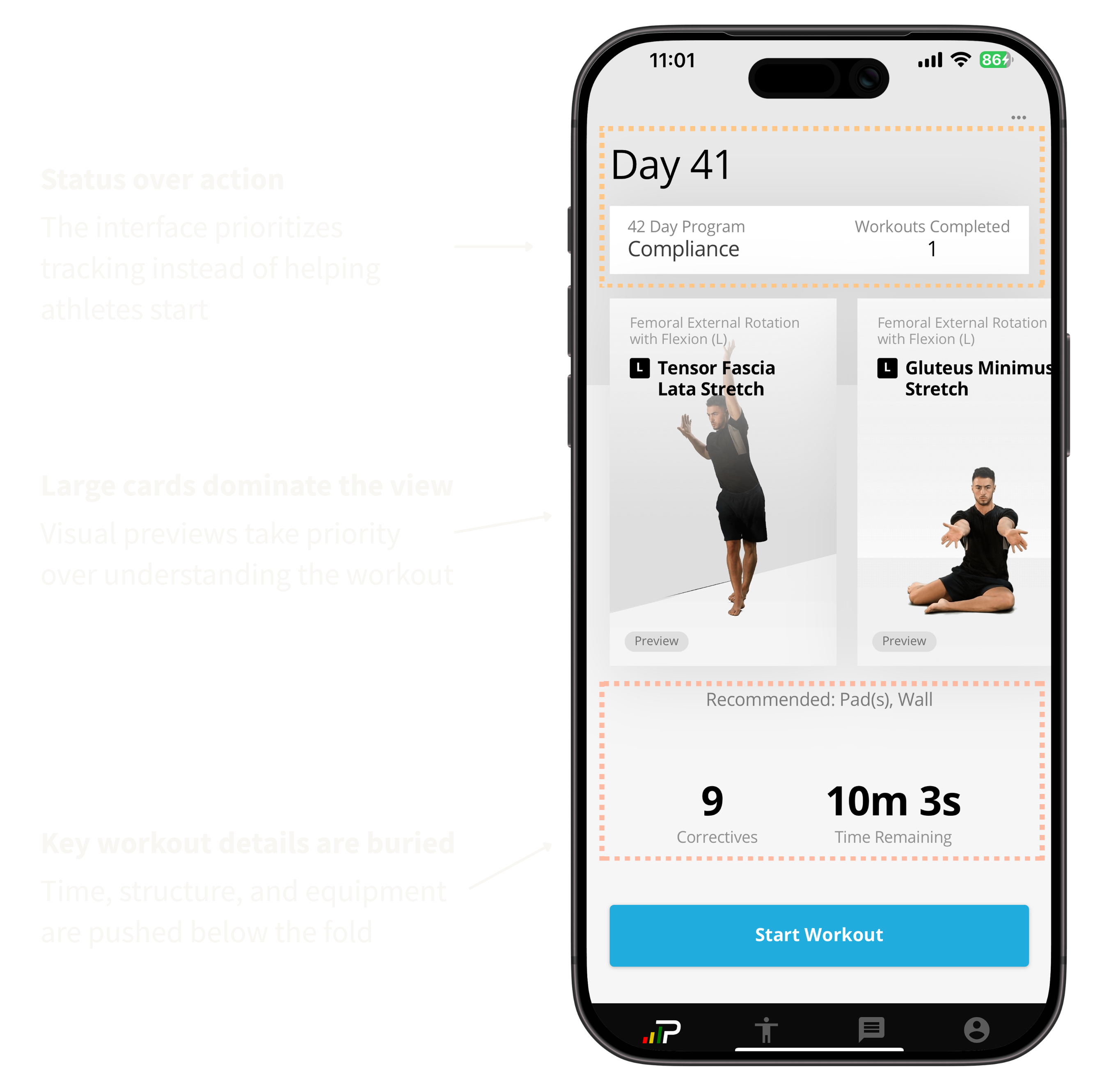
Early explorations focused on expanding the experience: adding navigation, preview states, saved workouts, and more context around the program. Each direction introduced useful pieces, but they still shared the same issue.

The interface continued to ask athletes to interpret the page before starting. This made it clear that the problem was not feature coverage or layout variation. It was how the workout information was structured.

Structure-first
Early structure-first program page exploration with tabs and workout benefits
Preview-first
Early preview-first workout exploration with large exercise image and insights
Feature-heavy
Early feature-heavy program exploration with workout card, tabs, schedule, and saved state

The shift: the solution did not need more features. It needed a clearer starting point, a tighter hierarchy, and a workout structure athletes could understand before tapping start.

05 - Design question

How might we turn a static exercise list into something that feels like a guided program?

The redesign needed to do more than restyle the page. It had to give athletes enough information to understand the session before starting, without adding a heavy onboarding moment or expanding scope beyond the two-week timeline.

The guiding question

What does this workout ask me to do, and why does it matter?

06 - Key decisions

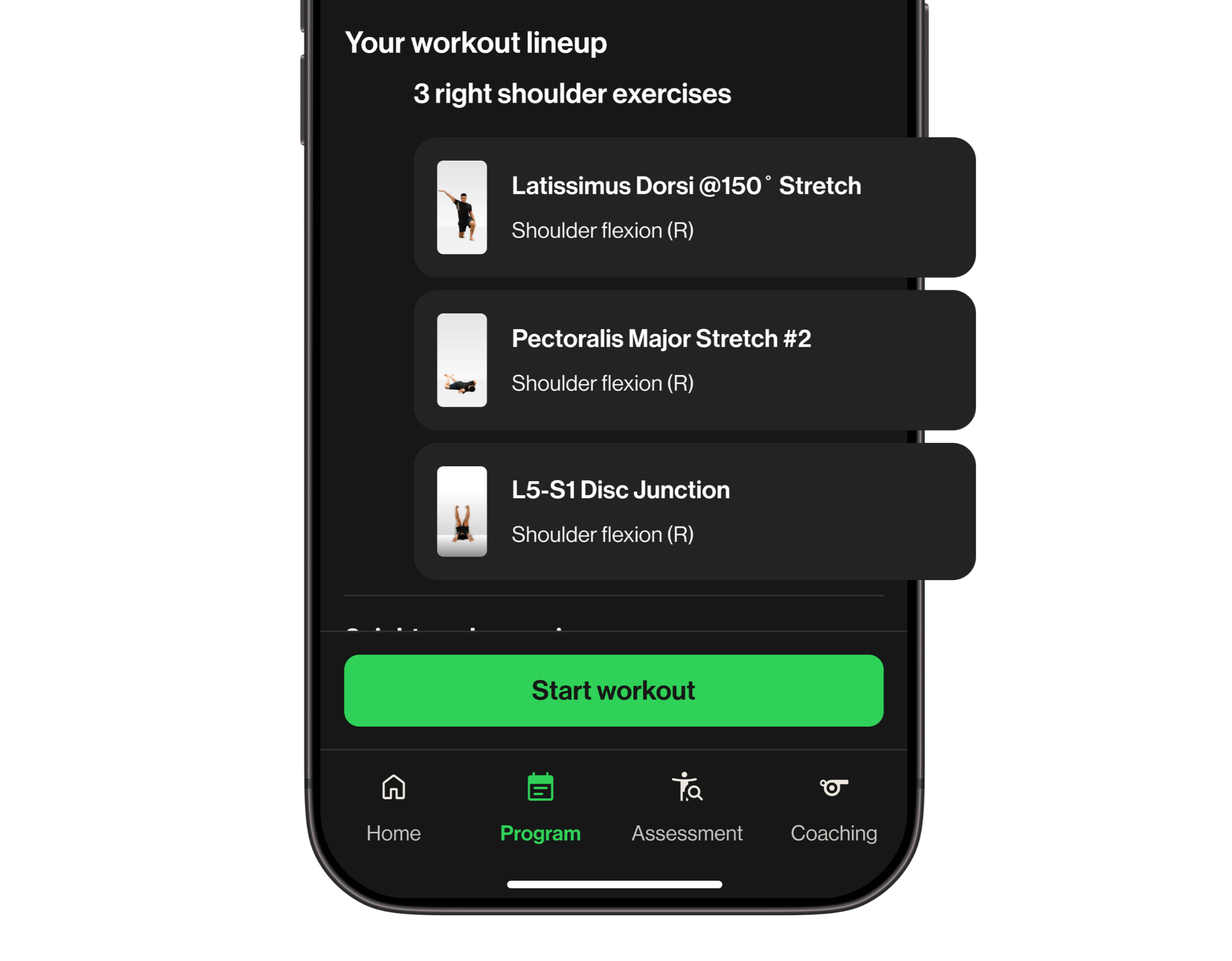
Two decisions shifted the page from a checklist to a program.

01 Move practical workout context to the top
The problem
The original page did not answer the basic pre-workout questions quickly enough: how long will this take, how many exercises are included, and what equipment do I need?
The decision
I created a session overview at the top of the page, grouping duration, exercise count, equipment, and status into one scannable area before the exercise list.
The shift
The page stopped asking athletes to interpret scattered details. It gave them a clear preview of the work ahead, which made the workout feel easier to start.
Before
Annotated workout screen highlighting issues with hierarchy and visibility
After
Workout context shown clearly at the top of the screen
02 Group exercises by body area
The problem
Athletes could see exercise names, but not always understand what they were targeting. Terms like Scalene Stretch or Thoracic Rotation were accurate, but unfamiliar.
The decision
Instead of renaming exercises, I added body-area headers such as Neck, Shoulders, and Core. This preserved accuracy while giving athletes a plain-language anchor.
The shift
Even when the exercise name was unfamiliar, the category explained its purpose. The list started to feel less like random tasks and more like a structured program.
Workout grouped by body area showing structured exercise list
Body-area categories helped athletes understand what each part of the workout was targeting

The constraint: this was a focused two-week redesign, not a full product rebuild. The strongest move was to reorganize information the system already had, rather than introduce new functionality that could not ship on time.

07 - Outcome

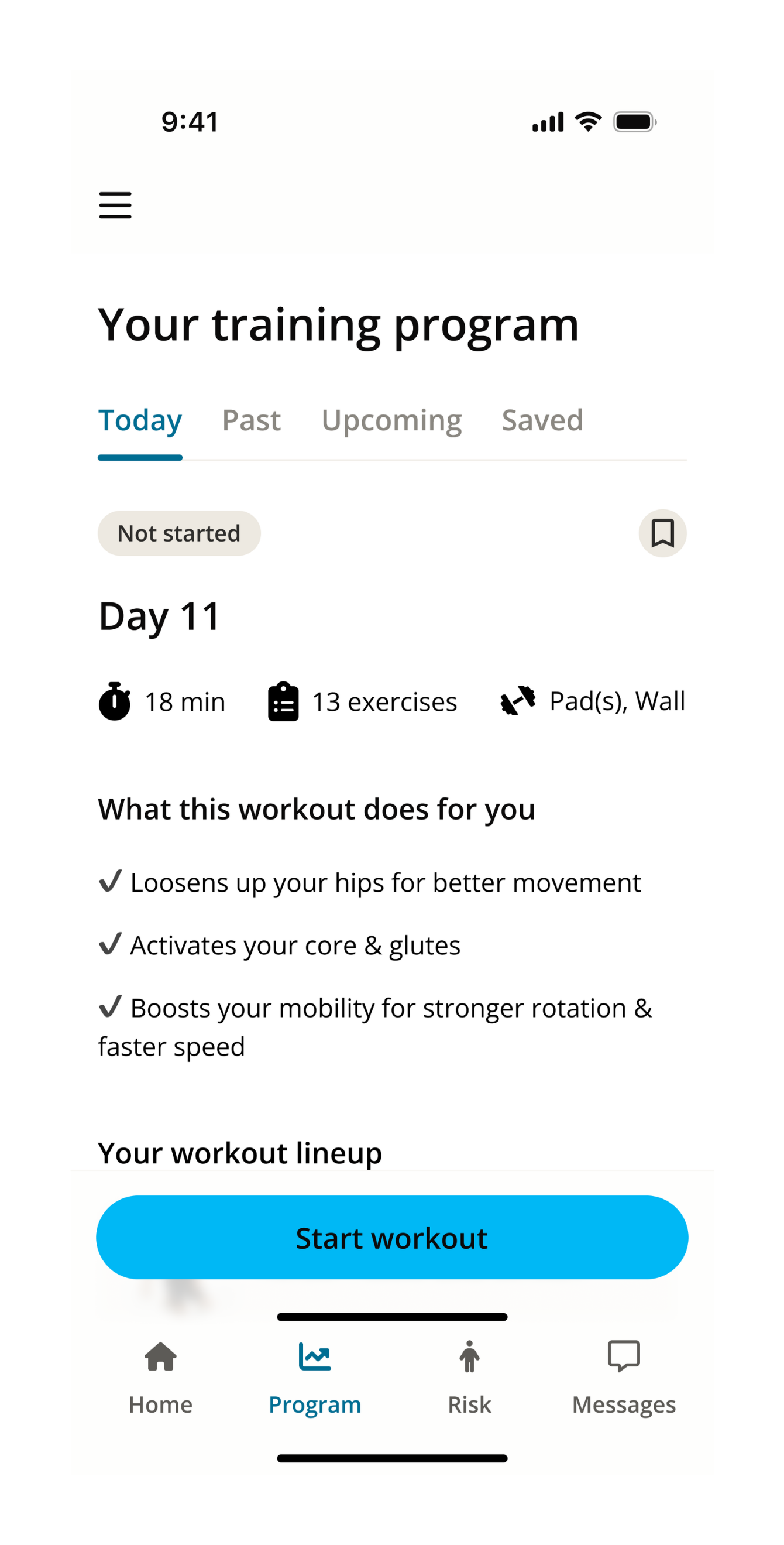
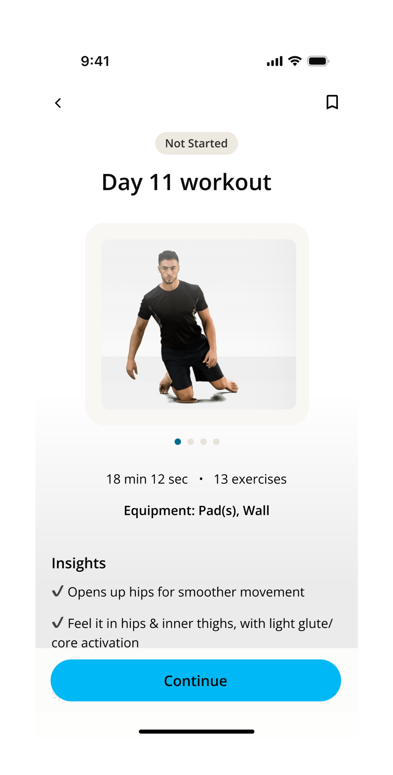
The page started to feel like a program, not a to-do list.

The redesign improved clarity and made the workout easier to follow. Athletes could understand what they were doing before starting, instead of interpreting the page during the workout.

Grouping exercises by body area gave each section meaning, helping connect the work to their own body. The biggest shift was not visual polish. It changed the experience from completing exercises to following a program.

Clear starting point Workout requirements visible upfront Athletes don’t have to search or guess what to do before starting.
Structured flow Exercises grouped into sections The workout is easier to scan and follow instead of feeling scattered.
Body awareness Exercises tied to targeted areas Athletes can understand what they are working on, not just the exercise name.
Guided experience From list to program The page shifts from a static list to a structured program that guides the workout.

The work started as a UI refresh. It became a reminder that a polished interface still fails when it carries the wrong user assumptions.

08 - What I learned

A new audience means new assumptions.

Do not copy a workflow into a new vertical

The professional athlete experience worked because the surrounding environment gave it context. Youth athletes did not have that same support, so the interface had to do more of the explaining.

Structure can be a form of motivation

Grouping exercises by body area did not add a new feature, but it changed how the page felt. The workout became easier to understand, and easier to commit to.