THE PROBLEM
An interface built for professionals didn't translate to youth athletes
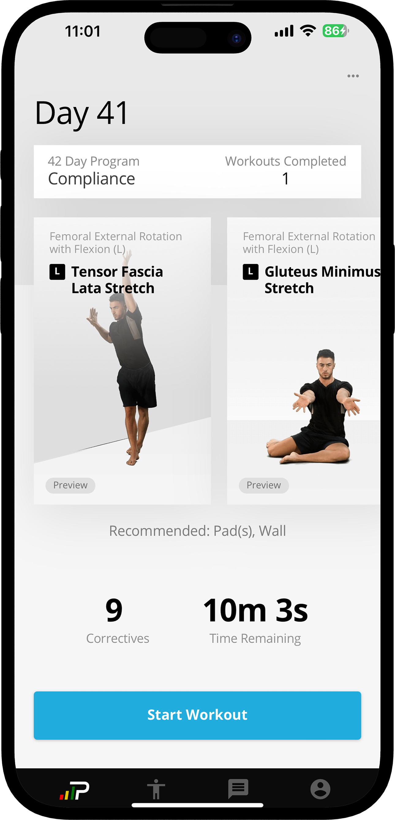
pºMotion was expanding into youth sports, a new vertical with different user expectations. The program page had been designed for professional athletes who understood their training and just wanted to get started. For them, a minimal exercise list worked perfectly.
For youth athletes, it fell flat. When they opened the app, they saw a list of exercises with no explanation of what they were working on, how long it would take, or why it mattered. The only progress indicator was a boring counter: "Workouts Completed: 1."
The old design: minimal context, just a compliance counter
For youth athletes used to engaging, modern apps, this felt basic and unmotivating. There was nothing to signal that their program was personalized, purposeful, or worth coming back to.
KEY DESIGN DECISIONS
Two decisions that made the program page work for youth athletes
Decision 1: Reorganize Information Architecture
The Problem: Critical information was scattered throughout the page. "Days" and "compliance counter" at the top were meaningless to youth athletes. Practical info (time, equipment) was buried at the bottom near the CTA. Athletes couldn't quickly answer "What am I about to do?"
My Thinking: Youth athletes need to scan and understand in 5 seconds before they commit. If they can't immediately see duration, what equipment they need, and what they'll be working on, they'll bounce. The most important information needs to be at the top, not scattered.
The Solution: Created a session overview card at the top with duration & exercise count (how long, how much), required equipment (what they need), "In progress" status badge (where they are), and moved compliance/days language out.
Why It Worked: Athletes could understand their workout at a glance. No hunting for basic info, no confusion about "Day 41" terminology that didn't resonate with youth users.
Decision 2: Making Exercise Names Understandable for Youth Athletes
The Problem: During conversations with athletes, a common frustration surfaced:
"I just want to know what I'm targeting or where I'm supposed to feel the stretch."
Many youth athletes didn't understand the exercise names in their workouts. Terms like "Scalene Stretch" or "Thoracic Rotation" were technically accurate but unfamiliar. When athletes couldn't tell what body part an exercise targeted, the workout felt confusing and disconnected from their body. The naming assumed anatomical knowledge they didn't have.
My Thinking: Youth athletes aren't physical therapy patients. They shouldn't need medical terminology to understand their workout. If an athlete sees "Scalene Stretch" and doesn't know it works the neck, the movement feels abstract. Without clarity on what they're targeting, it's harder to perform the exercise with intention and confidence.
The Solution: Rather than renaming exercises, I introduced clear body-area categorization (e.g., "Neck," "Shoulders," "Core") so athletes could instantly understand what they were working. The body-region label gave context to technical terms without sacrificing accuracy.
Why It Worked: Athletes could quickly scan their workout and understand its structure. Even if the exercise name was unfamiliar, the body-area category clarified its purpose. By anchoring clinical terminology to intuitive body regions, we made workouts feel more accessible and intentional, especially for youth athletes new to structured training.
Before: Technical names, no context
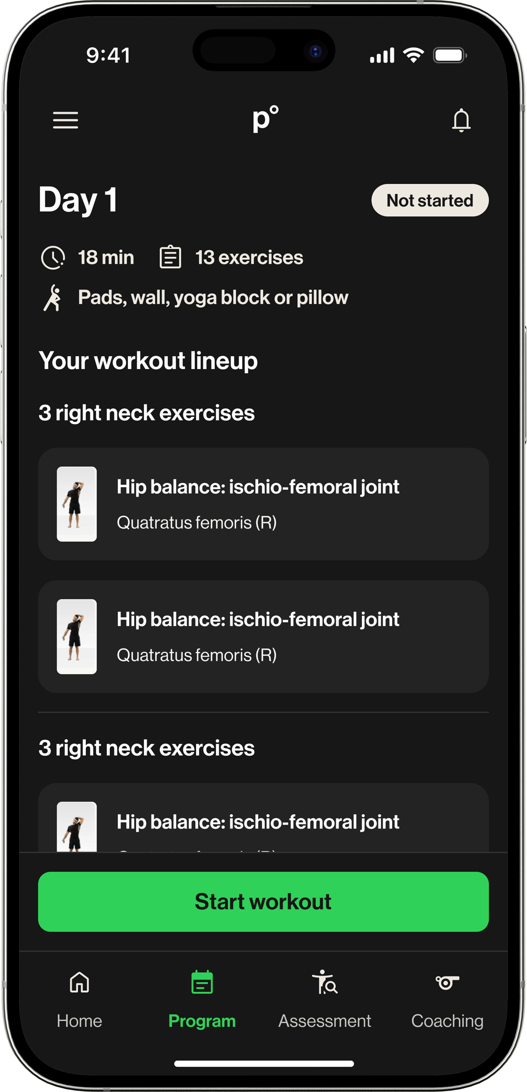
After: Body-area categories added