CONTEXT & USERS
pºMotion serves youth athletes completing corrective exercise programs
Parents pay for the experience and want reassurance. Athletes are responsible for completing the work.
What Parents Needed
- Simple confirmation workouts were completed
- High-level visibility rather than detailed metrics
- Less need to ask their child directly
"Just something simple. Like, green if he did it."
Parents needed visibility.
What Athletes Needed
- A better understanding of their progress
- Motivation without feeling micromanaged
- A reason to stay consistent
"A streak like Duolingo would be awesome. I wouldn't want to break it."
Athletes needed ownership.
The dashboard had to support both.
THE CHALLENGE
Providing visibility without making athletes feel overly monitored
The Tension
If the dashboard showed too much detail, it risked reducing athlete ownership. If it showed too little, parents would continue checking in manually.
The Approach
Through early iterations, I focused the design around a simple question that would guide every decision.
The Guiding Question
Did they complete their workout today?
This question became the foundation for three key design decisions.
KEY DESIGN DECISIONS
Three decisions that balanced parent visibility with athlete motivation
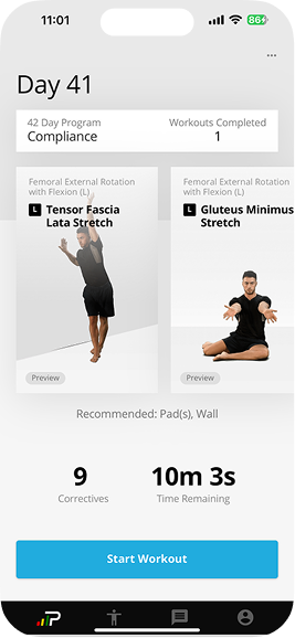
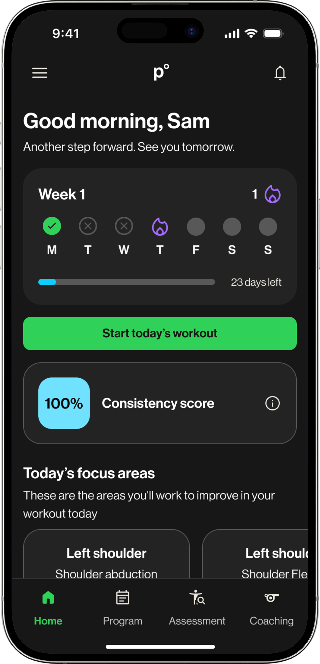
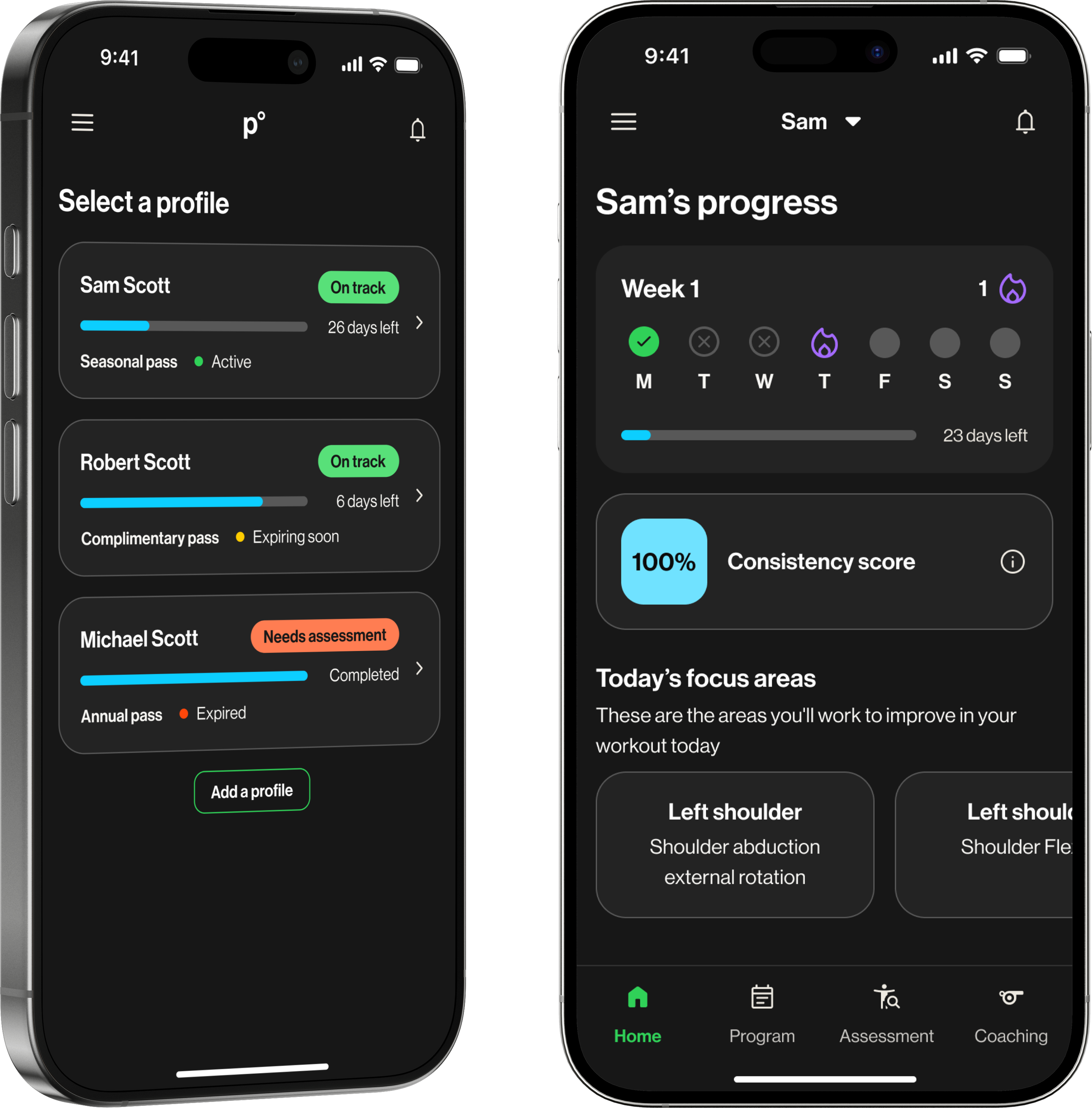
Decision 1: Make Daily Completion Easy to See
The Problem: Early designs focused on monthly calendars and compliance percentages. They showed overall performance but did not clearly highlight today's status.
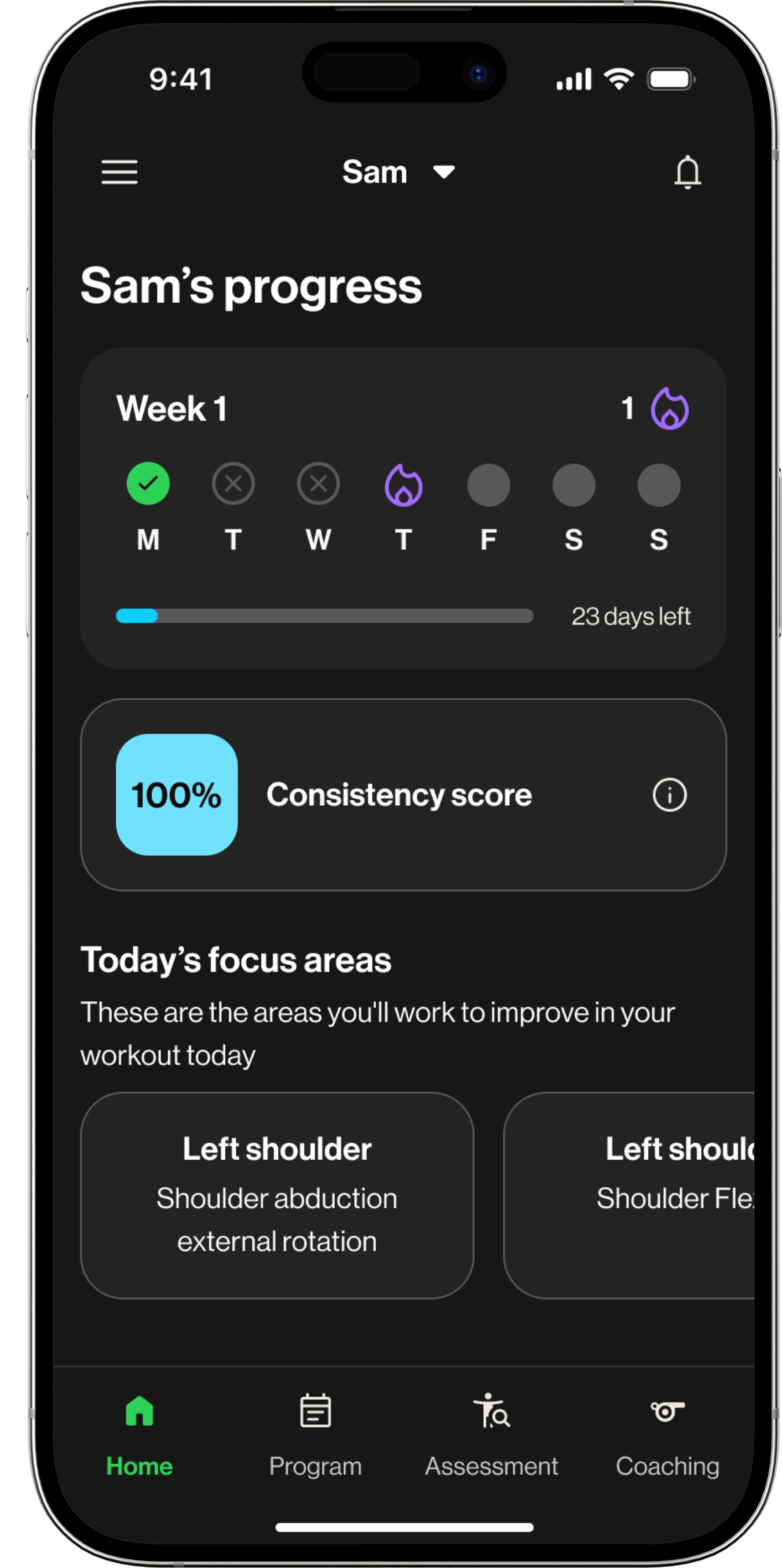
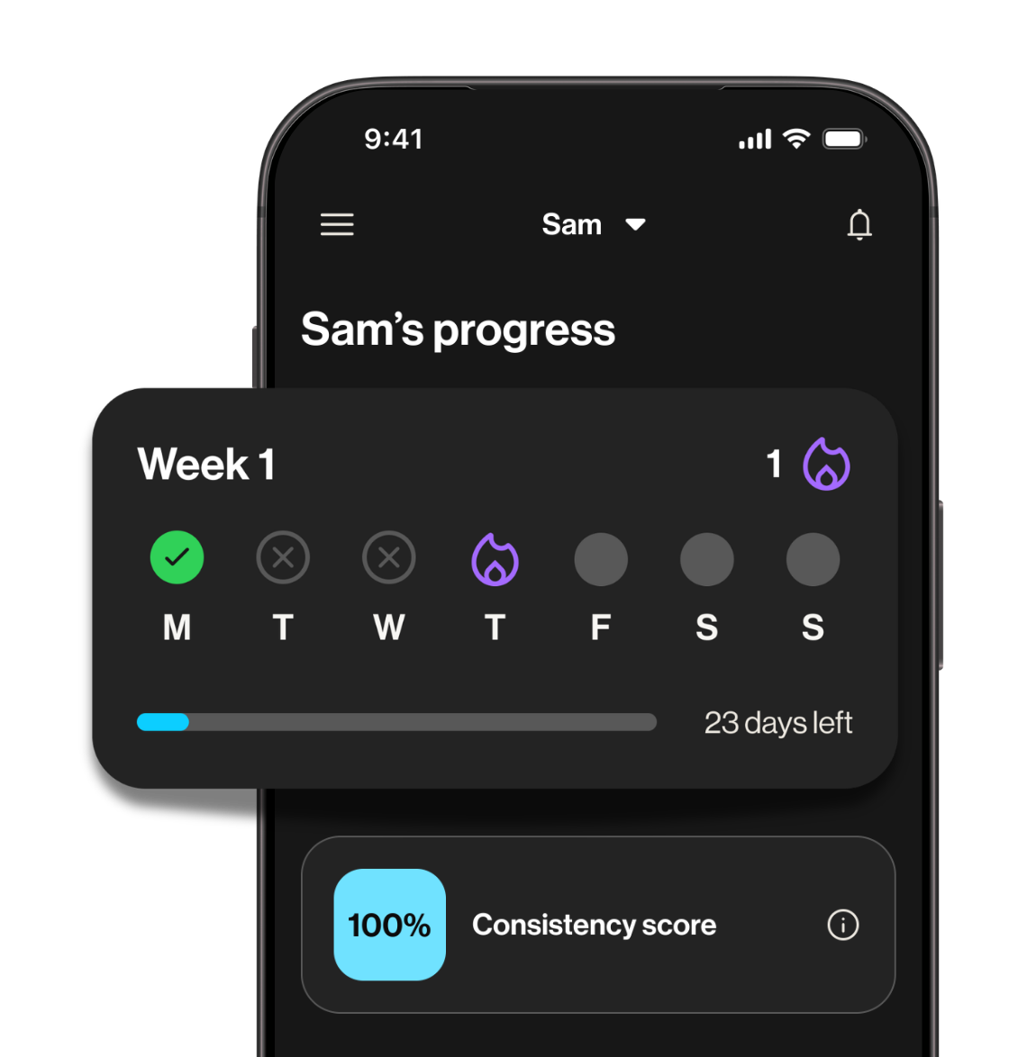
My Approach: I simplified the layout and brought a weekly streak strip to the top of the screen so completion was visible immediately.
The Outcome: Parents could quickly check status. Athletes saw a streak they could maintain. The dashboard became easier to scan.
Before
After
Decision 2: Deprioritize the Consistency Score
The Problem: Compliance percentages competed for attention and made the screen feel more evaluative than supportive.
My Approach: I kept the consistency score but positioned it below the streak so it supported the main message rather than competing with it.
The Outcome: Progress was still visible, but the experience felt lighter and more motivating.
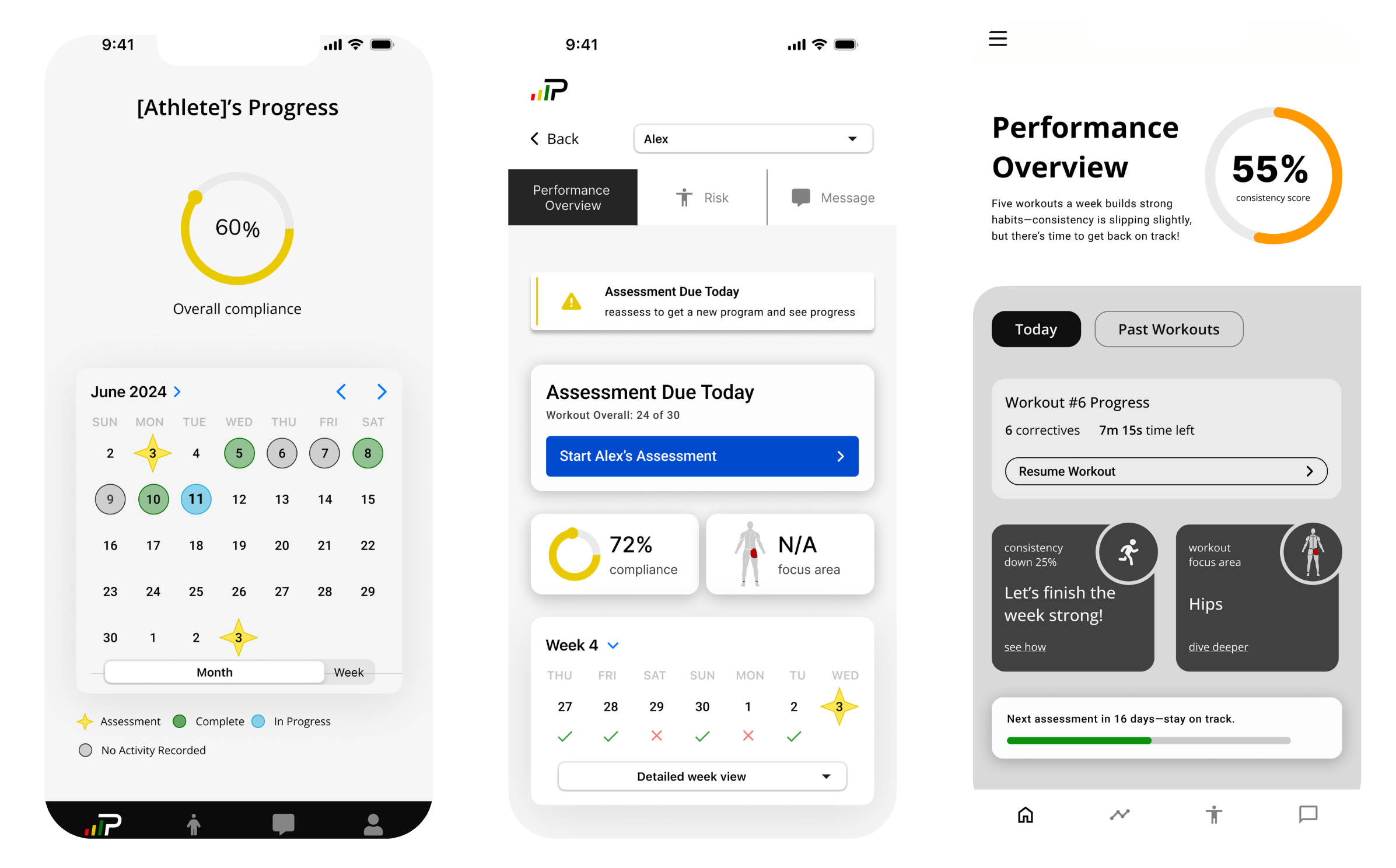
Exploring visual hierarchy
Final result
Decision 3: Show Weekly Focus Areas
The Problem: Athletes mentioned that workouts sometimes felt repetitive, and it was hard to see the purpose behind them.
My Approach: I added a Focus Area section that outlined the targeted body regions and goals for the week.
The Outcome: Athletes had more context for why they were doing the exercises, and parents could see structure behind the program.
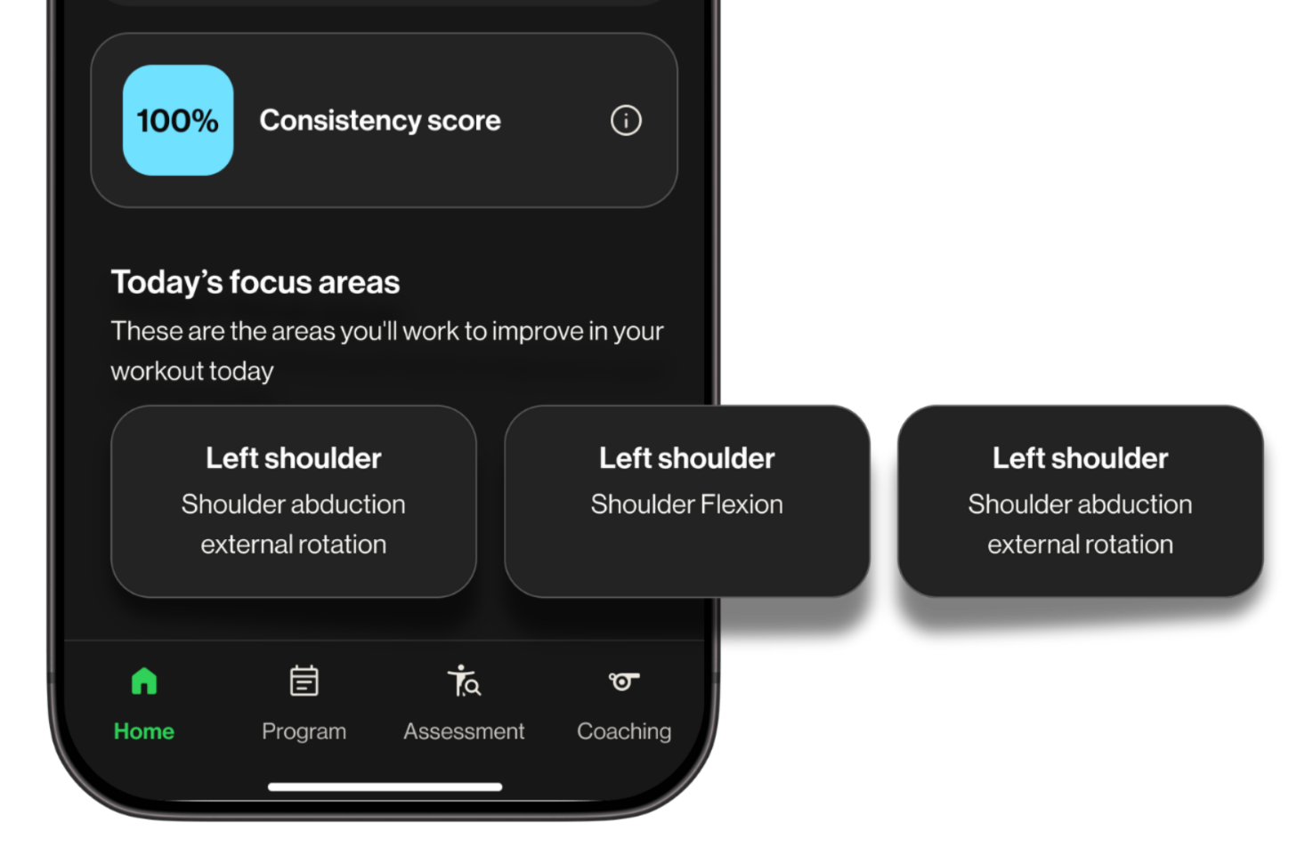
Focus areas provide context
THE EXPANSION
From parent visibility tool to athlete motivational landing screen
Before launch, the CEO responded positively to the dashboard and discussed with the PM and engineering lead whether it could also benefit athletes directly.
Instead of landing straight into workouts, athletes could land on their streak and progress first. This gave them a clearer sense of momentum when opening the app.
The dashboard was adapted into the athlete-facing experience, shifting from a parent visibility tool to a motivational landing screen.
Athlete Experience
Before: Straight to workouts
After: Landing screen
Completion celebration
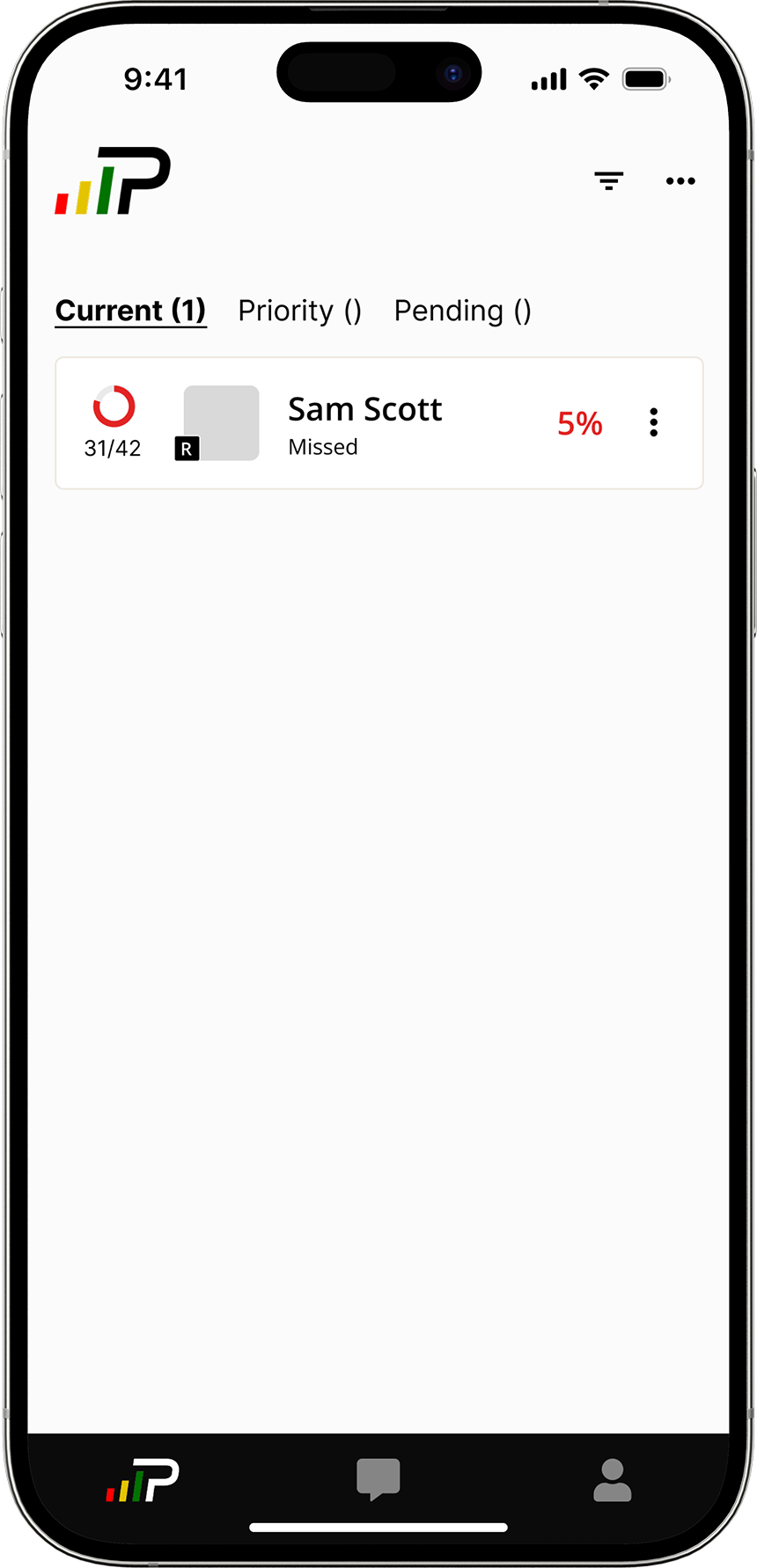
Parent Experience
Parent dashboard