A three-year-old platform expanding into a vertical it wasn't built for
p°Motion is a precision movement platform that uses biomechanics data to identify injury risk and generate personalized corrective programs.
Built by coaches, clinicians, and data scientists with over 30 years of experience, the platform had spent three years serving professional teams before expanding into youth athletics and families.
That shift introduced a fundamentally different dynamic. Professional teams had coaches and performance staff interpreting the data. Families did not.
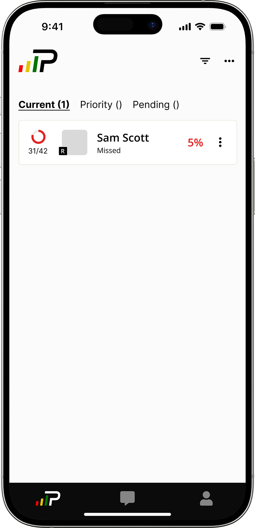
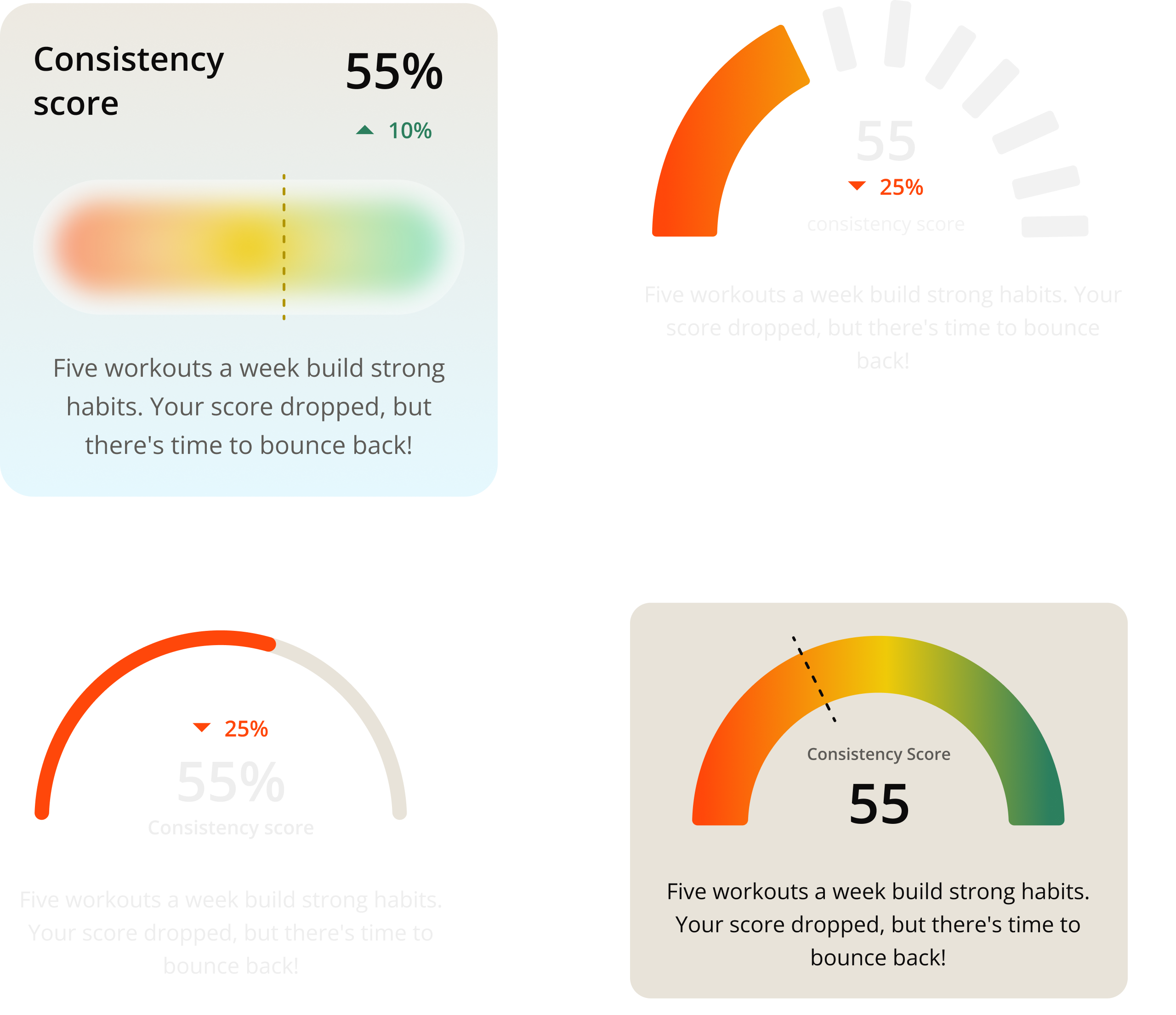
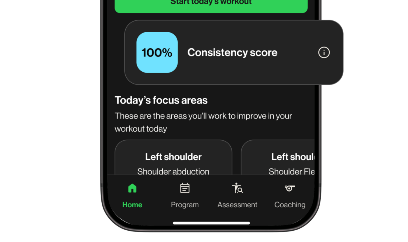
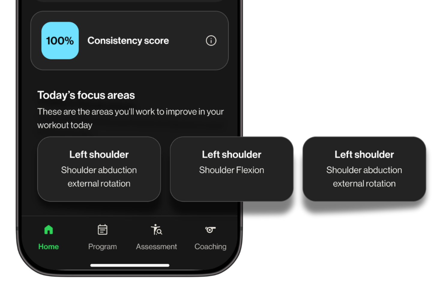
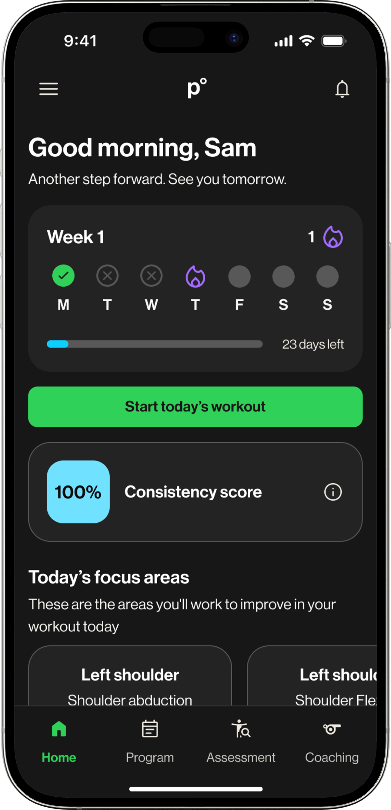
Parents were given default access to the coach-facing admin view: a roster list showing their child's name, a partially filled progress circle, a compliance percentage in red, and a "Missed" status label.
No context, no history, and no way to tell whether that number was alarming or normal.
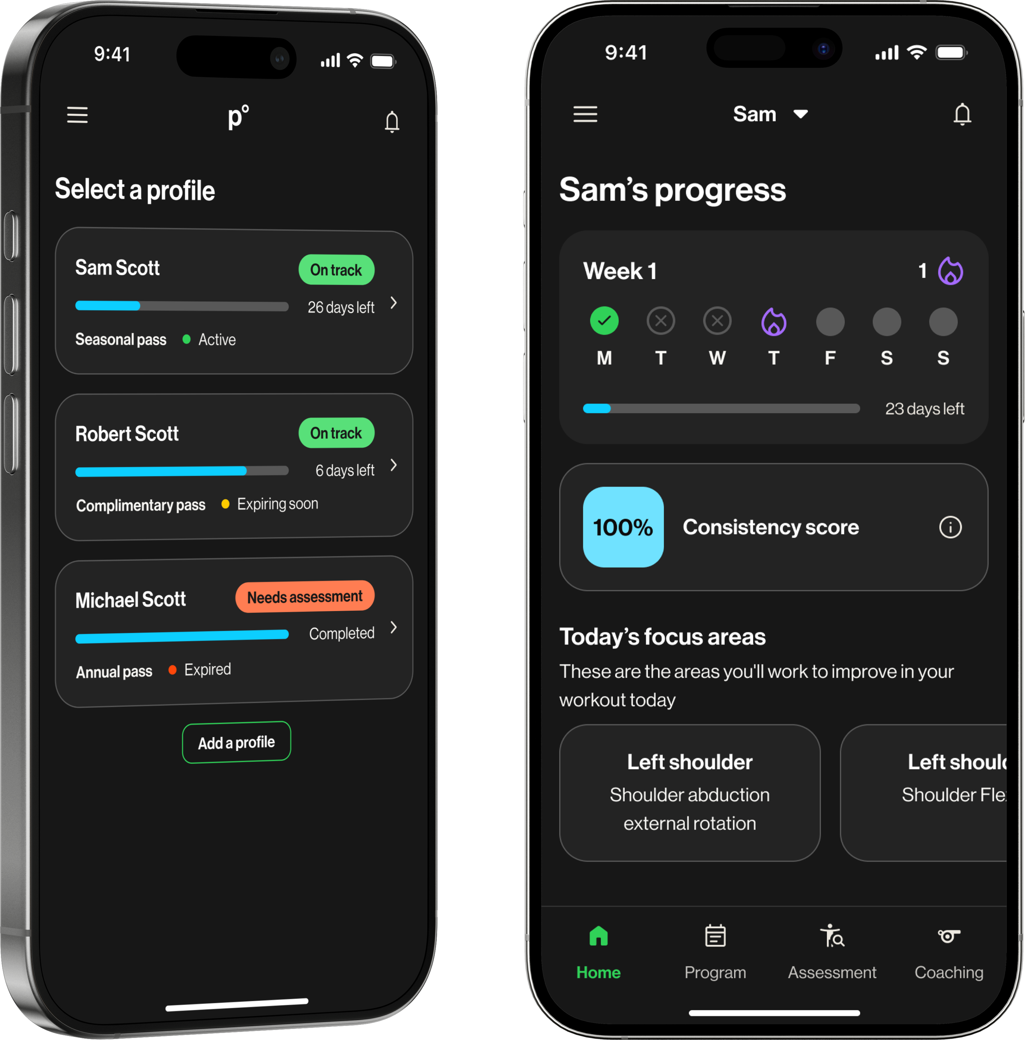
This project was scoped as a parent-facing tool from the start: a progress dashboard built from scratch to give families the visibility the admin view had never provided. Athletes were in scope, but secondary.
I was the sole designer, working within a one-month sprint alongside a PM, an engineering lead, and a senior designer.
Two users. One screen. Competing needs.
The dashboard had to serve two people with fundamentally different needs. Solving for one carelessly would undermine the other.
Visibility
Not data, just a clear answer to one question: did my kid do their workout today? Every parent was already asking their child directly. The dashboard needed to make that conversation unnecessary.
Ownership
Motivation, not monitoring. Streaks, progress, a sense of momentum. A dashboard that felt like surveillance would reinforce exactly the dynamic parents were trying to move away from.
What parents needed to see, athletes needed to feel.
By the time athlete interviews ran, the parent dashboard was nearly finished. The CEO asked whether athletes could use it too, and before committing, we ran research to validate whether the design would actually work for them.
I led both streams end-to-end: writing discussion guides, running sessions, and synthesizing findings back to the team.
Parent research confirmed the direction. Athlete research changed one thing, and it was the most important thing.
Parent research · 5 participants
Athlete research · 4 participants
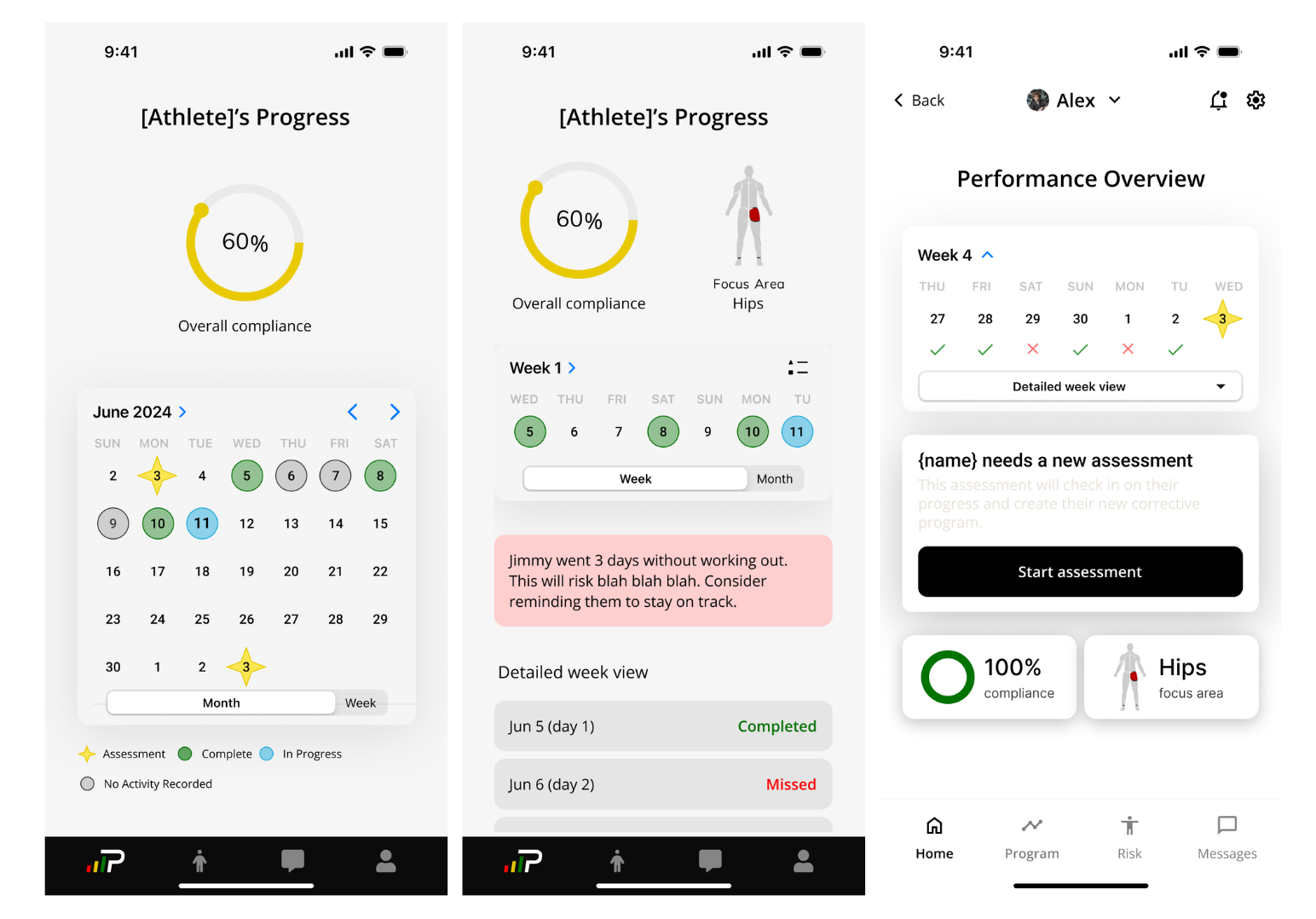
The calendar strip could not stay a simple progress check for parents. Research showed it also needed to motivate athletes, turning the same element into visibility for one user and momentum for the other.
Not what data can we show. What does a parent need to know right now?
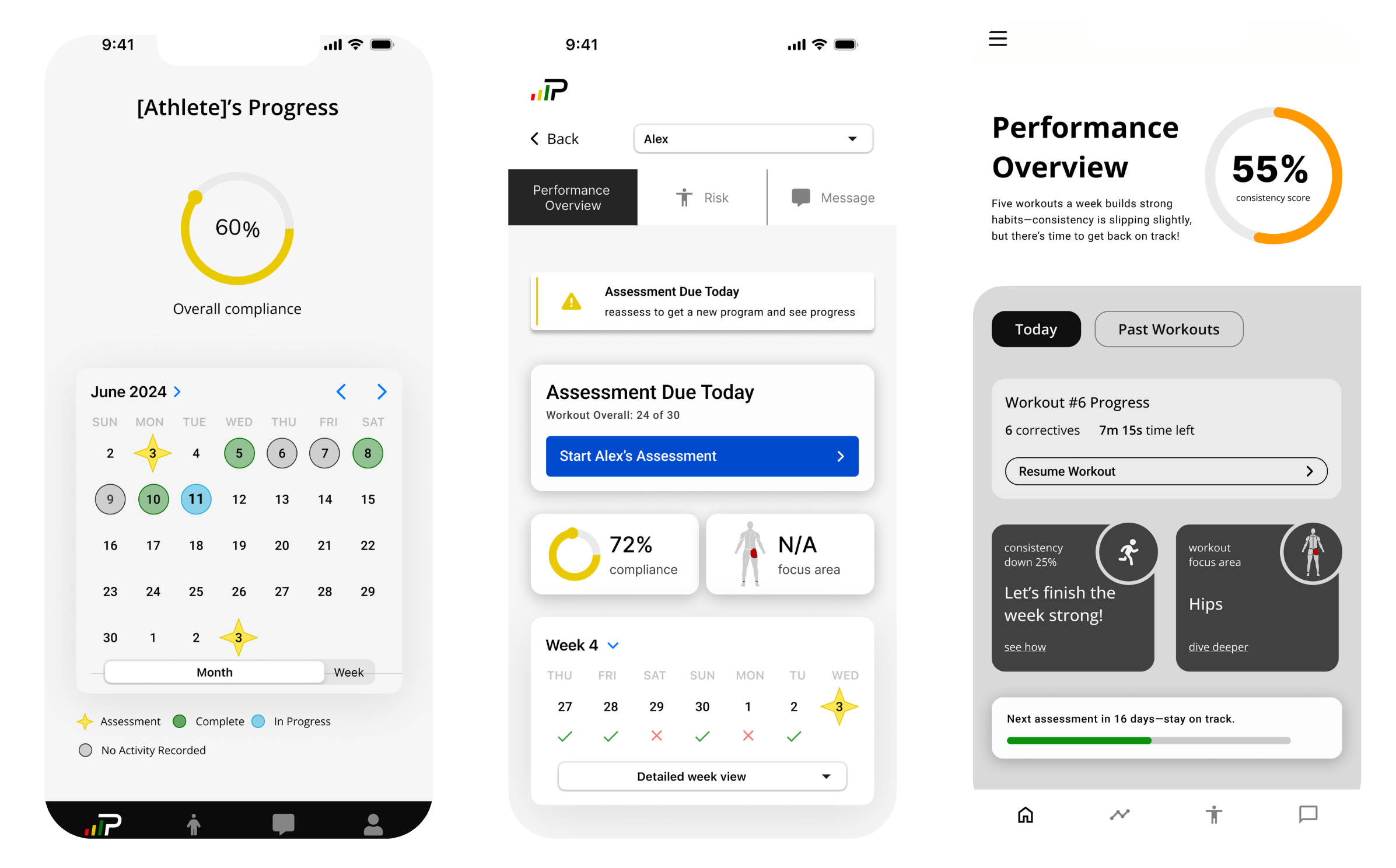
Before the design had a clear direction, it had too many competing ones. The PRD outlined a comprehensive compliance dashboard: progress bars, monthly summaries, session logs, insights reports, data export. Thorough, and the wrong starting point for this audience.
Early explorations kept landing on calendar-based layouts: monthly grids with color-coded days, status icons for completed, missed, and in-progress sessions. On paper it made sense. In practice, it meant scanning 30 cells to answer a question parents could have just asked their kid.
Did they complete their workout today?
Every decision filtered through one test: does this motivate or monitor?
Three decisions defined the final design. Each was evaluated against the same question: does this motivate, or does it monitor?
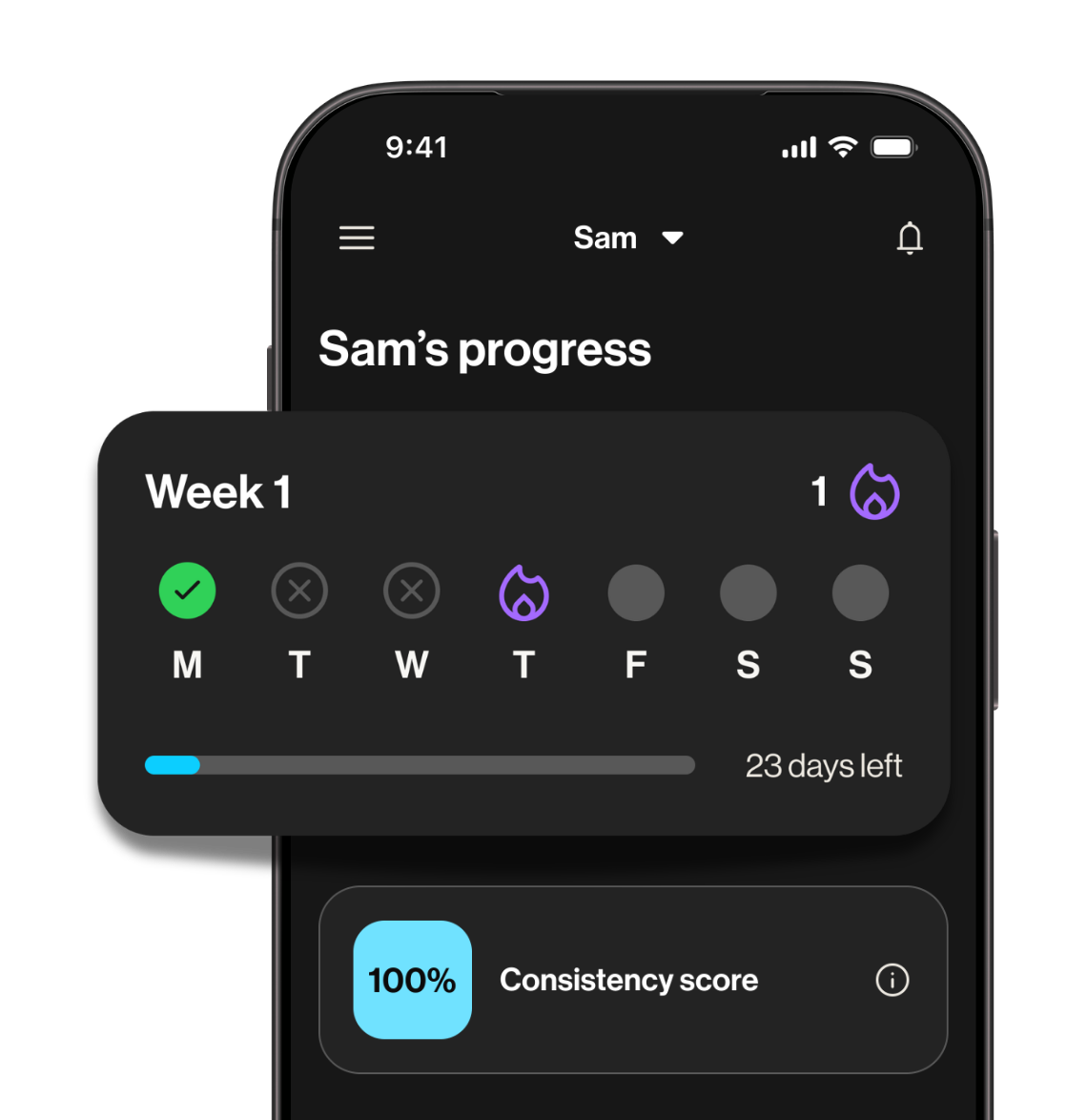
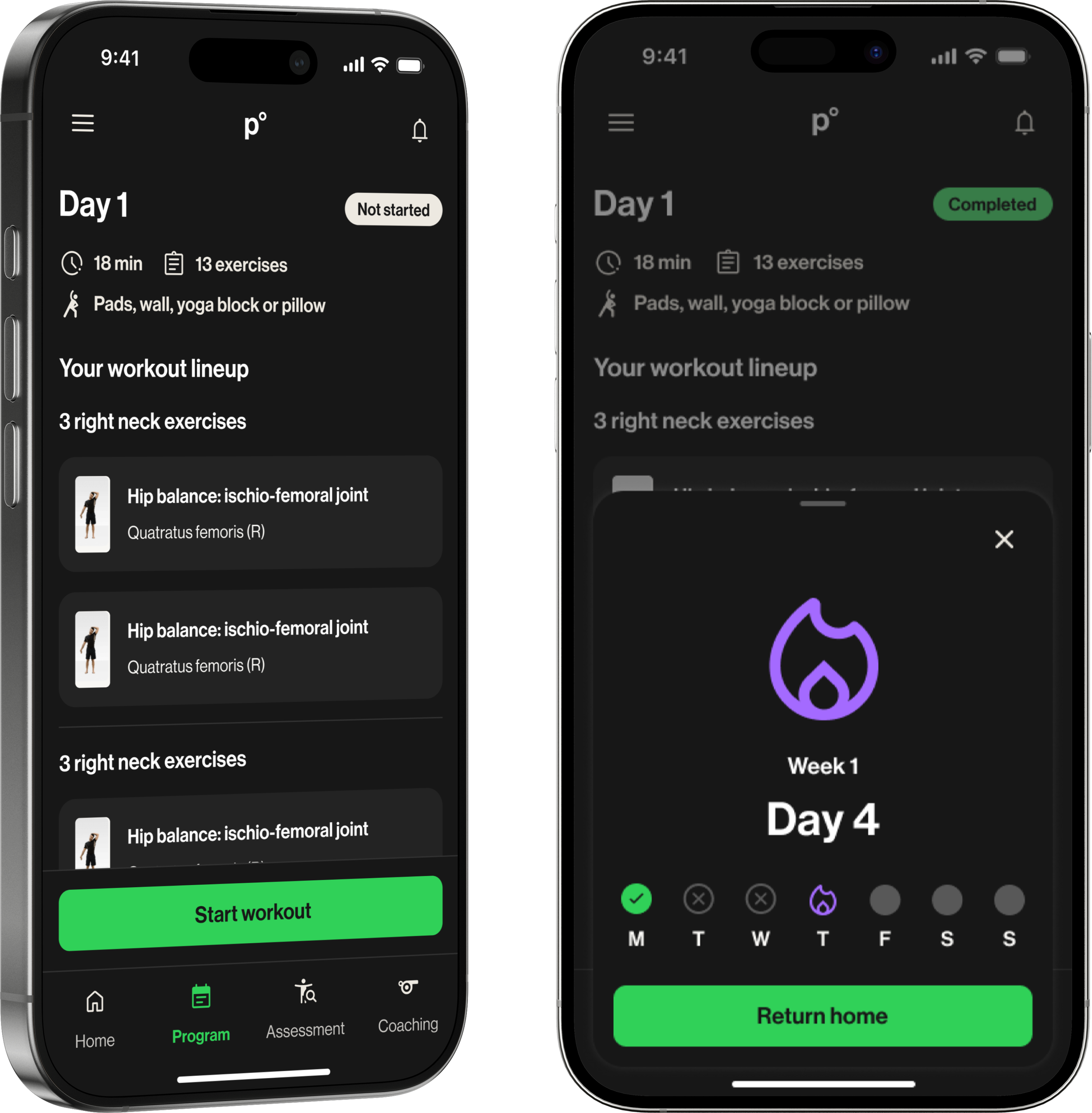
Streak freeze state: advocated for, not shipped
I pushed for a streak freeze mechanic — a way for athletes to protect their streak if they completed most, but not all, of their weekly workouts.
The risk was clear. If someone loses everything for missing one day, they are more likely to stop than start over.
Engineering pushed back on timeline, so it shipped without it.
If I revisited this, I would scope the backend work earlier so the streak could ship with the protection it needed to actually work.
From parent visibility tool to athlete landing screen
Athletes were not in scope for most of the project. Parents were the underserved user, and that was the right place to start.
Late in the project, the CEO asked a simple question: could this work for athletes too?
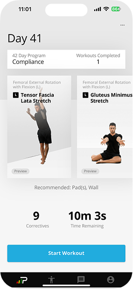
Athletes had no dedicated home screen. They landed directly on their workout list with no context and no sense of where they were in their program. The dashboard could fix that.
Before committing, we ran athlete research to validate the design would work for them, and that is where the streak direction came from.
The adaptation was lighter than expected. The main structural difference was at the top of the screen: where parents saw their child's name and progress, athletes saw a personalized welcome and a motivational prompt. The rest carried over.
Retention up. Users up. Conversations down.
The dashboard launched to the youth vertical over the summer.
The vertical had been difficult to scale precisely because there was no purpose-built experience for families. Onboarding new athletes meant handing parents a tool never designed for them.
A dashboard built for parents became a motivational entry point for athletes. One design solved two problems that nobody had connected before.
Run research before design begins, not alongside it
Run research before design begins, not alongside it
Findings validated late-stage work rather than shaping early decisions. The instincts were right, but that was partly fortunate. Earlier research means sharper constraints and more defensible decisions.
Ship the forgiveness logic or do not ship the streak
Post-launch confirmed the risk: athletes who lost their streak for one missed day were more likely to disengage than restart. The fix was not a UI change. It was a backend scope decision that needed to happen earlier in the project.